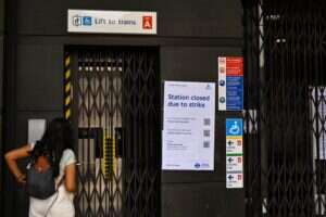
Can you name the British designer and artist whose work is seen by millions of Londoners each day? Whose designs have become a visual byword for the city itself? Whose work is beautiful yet entirely functional?
You wouldn’t be alone if you didn’t say Edward Johnston. A master calligrapher, typographer and scholar of medieval manuscripts and the Roman letter form, he was a strange choice even at the time to create a uniform look for the fledgling London Underground system. Ensconced in his ramshackle and overflowing house near the Sussex Downs, furiously procrastinating over his latest commission, he was a million years away from the creative agencies and think-tanks associated with modern branding exercises.
Johnston at work. Image: Wikimedia Commons.
Chosen he was though – by Frank Pick, publicity officer and pioneer of transport identity, on the strong recommendation of Johnston’s former pupil Eric Gill. Johnston had taught for many years at the Central School (later Central St Martins) and The Royal School of Art. He inspired awe and not just a little creative genius in the pupils who passed through his classrooms.
Pick wanted a London Underground typeface that was bold and clear enough to be read from a distance, and distinctive enough to not be confused with the clamour of competing advertisements. Drawing on his deep love of Roman lettering, which had graced temples and tablets perfectly legibly for thousands of years, Johnston withdrew to his study to procrastinate furiously.
What emerged, eventually, was the font of the London Underground – Johnston Sans. Not only that, but Johnston had also designed the red circle and blue line roundel that graces every Tube stop sign and tourist tea towel since.
Johnston designed the font not only to be legible; he also designed the lettering so that signwriters could easily and quickly copy and paint them across the network.
An extract from Edward Johnston’s “Writing & Illuminating & Lettering”. Image: D&B Books.
That was exactly one hundred years ago this year – and, apart from a couple of minor alterations, Johnston Sans has remained the font of the Underground for all that time and doubtless another century to come. Combined with the roundel, the two are arguably the first and most successful attempt at a city to brand itself.
Look upwards at the entrance to Edgware Road (H&C) and you can see remnants of Johnston’s original font work. It can still be found on the network if you know where to look – and when you see it, you’ll know it. So let’s hear three cheers for Edward Johnston, the man who designed the way London feels. And if not now, there’s always 2116.
David Dunn is the founder of D&B Books, publisher of Edward Johnston’s “Writing & Illuminating & Lettering”.


